TRAPICHE
Complete rebranding of a Madrid smash burger restaurant — from logo and visual identity to social media strategy.
The Challenge
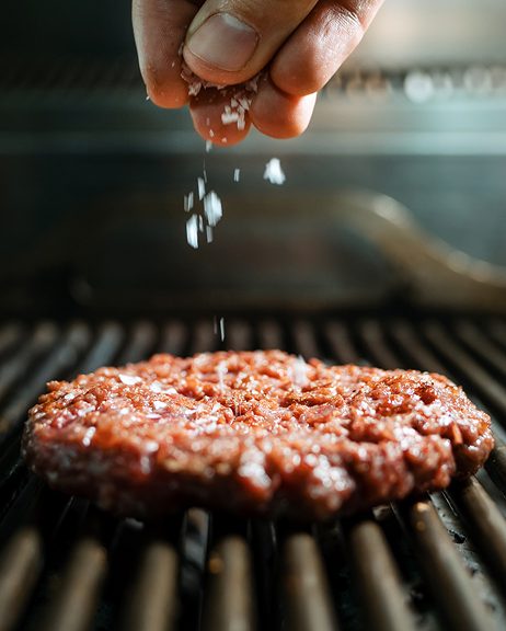
Trapiche was a grill restaurant in Madrid with an outdated identity that didn’t reflect the quality of its food. The old branding felt generic — a cluttered oval logo, no defined color system, and a social media presence with barely any traction. The goal was clear: transform Trapiche into a bold, modern smash burger brand that could stand out in Madrid’s competitive food scene and build a real community online.
Brand Identity
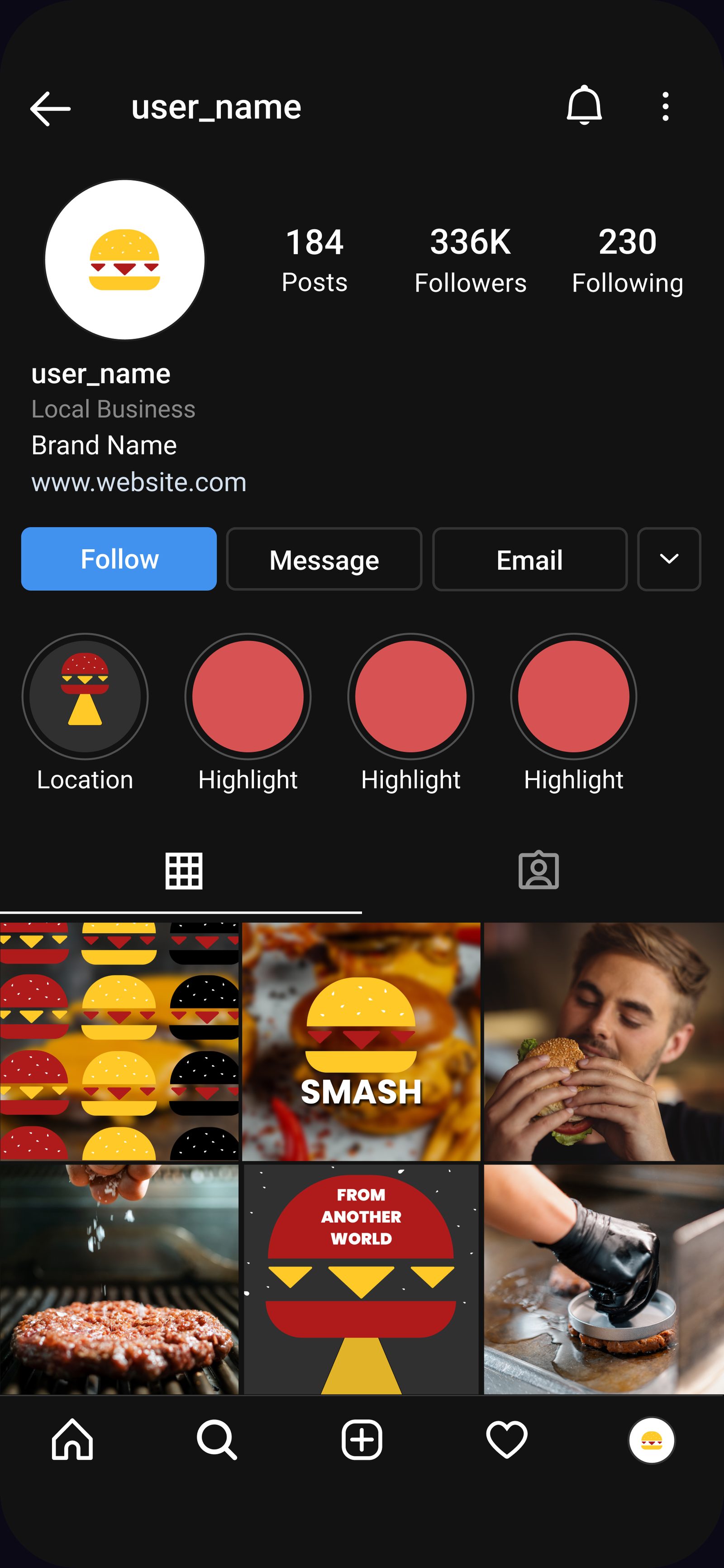
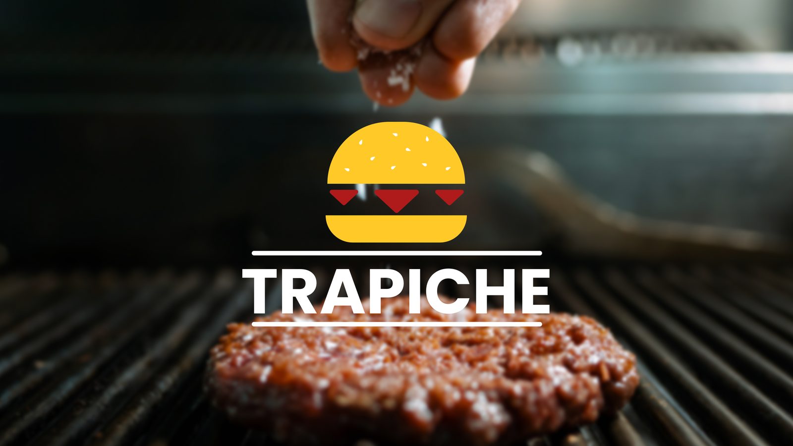
The new identity needed to feel as bold as the food itself. I built the visual system around three core colors — yellow for the bun, red for the sauce, and black for the grill — creating an instant connection between the brand and the product. The logo combines a burger icon with clean, heavy typography that works across every touchpoint, from signage to social media profile pictures.
Color Palette
Typography
Montserrat — Black / Extra Bold
TRAPICHE
Before & After
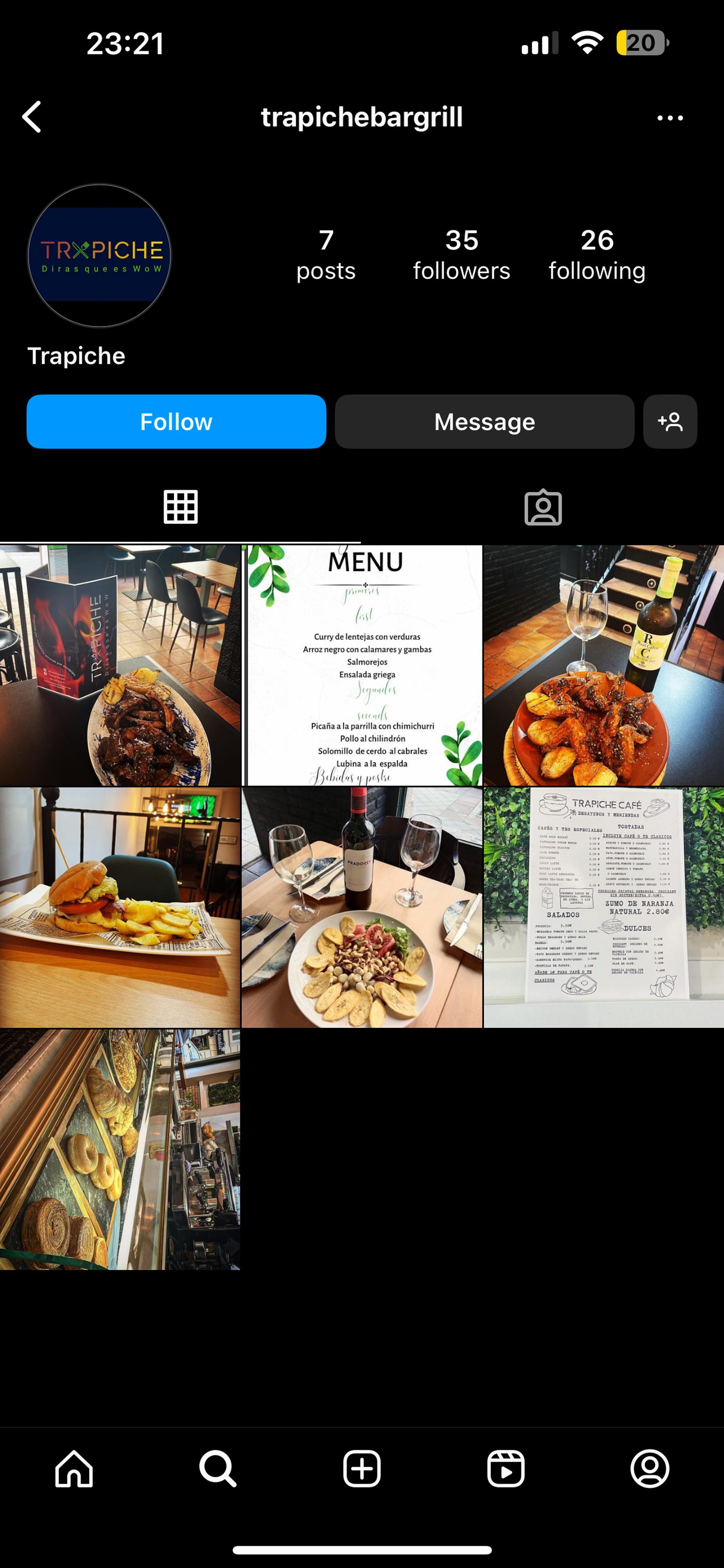
The transformation went beyond aesthetics. A new logo, a cohesive visual language, and a content strategy built from scratch took Trapiche from 35 followers and 7 posts to over 336K followers — proving that strong branding paired with consistent content can turn a local restaurant into a recognized brand.
Logo
Before
After
Before
After