FETRANSPER
A waste transport company with forty years behind it and a website that made it look like a startup nobody had heard of. This is the rebuild.
The real site, running inside this page. Click once to scroll and click through it.
The Problem
FetransPer moves industrial waste around Madrid and Castilla-La Mancha. Own fleet since 1996, part of a group that has been doing this since 1986, clients like Urbaser, Pladur and Smurfit Kappa. None of that came across on their old site, which looked like a template somebody filled in once and never opened again.
The brief I set myself was simple. Anyone landing there should understand in five seconds what the company moves, where, and with what. And the whole thing had to stay editable by the team afterwards, so I rebuilt it in WordPress rather than handing over something only I could touch.
Drawing the fleet instead of photographing it
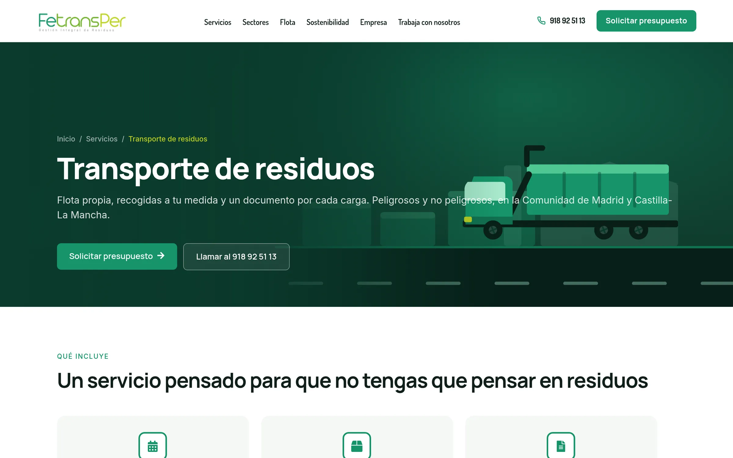
Stock photography of trucks looks like stock photography of trucks. The client photos that existed were inconsistent and sat badly next to each other, so I threw the lot out and drew the fleet flat and vector: eight truck types and fifteen container formats, all in the same line and the same palette.
It solved two things at once. The service pages finally looked like they belonged to one company, and a customer trying to work out whether they need a 10 cubic metre container or a 200 litre drum can now see the difference instead of reading it.
Putting the homepage in the order people actually read it
The first version opened with three blocks of credentials before saying what the company does. Certifications, years in business, group structure. All true, all premature.
So I reordered it. What they do, the fleet that does it, how the process works, then who they do it for, and only after that the proof. Credentials land when somebody already wants to believe you.
Green, and one green
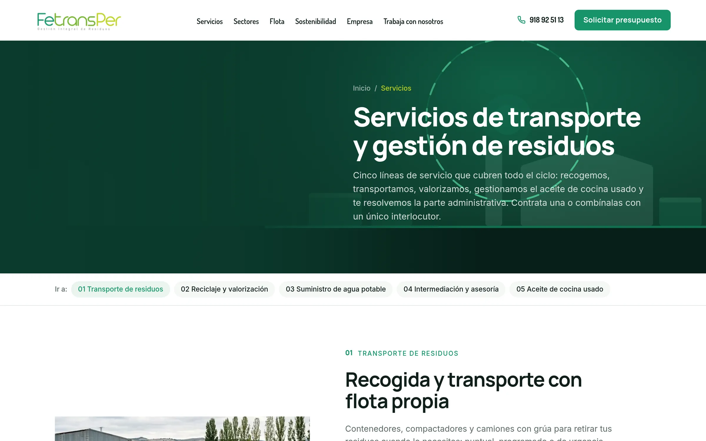
The brand had drifted into three or four greens plus a teal that came from nowhere. I picked one, took it from their own logo, and used a lime accent only where something genuinely needed to jump. Animated section covers per service, each with its own motif, so the site has some life without a single autoplaying video.
The phone, which is where most of it gets read
Half their traffic is somebody standing in a yard. The mobile build came with the same care as the desktop one, down to the hover states, which on a touchscreen were leaving a shadow stuck to whatever you last tapped.