EKA
Complete rebranding of a Madrid beauty center — from a dated identity to a refined, premium visual system that reflects the quality of its treatments.
The Challenge
EKA was an established beauty center in Madrid offering premium facial and body treatments, but its visual identity told a different story. The old logo — a golden circular emblem with ornamental script — felt outdated and disconnected from the modern, sophisticated experience inside the salon.
The brief was to strip everything back and rebuild: a new logo, color system, typography, and social media presence that would position EKA as a premium destination for beauty and wellness in Madrid.
Before & After
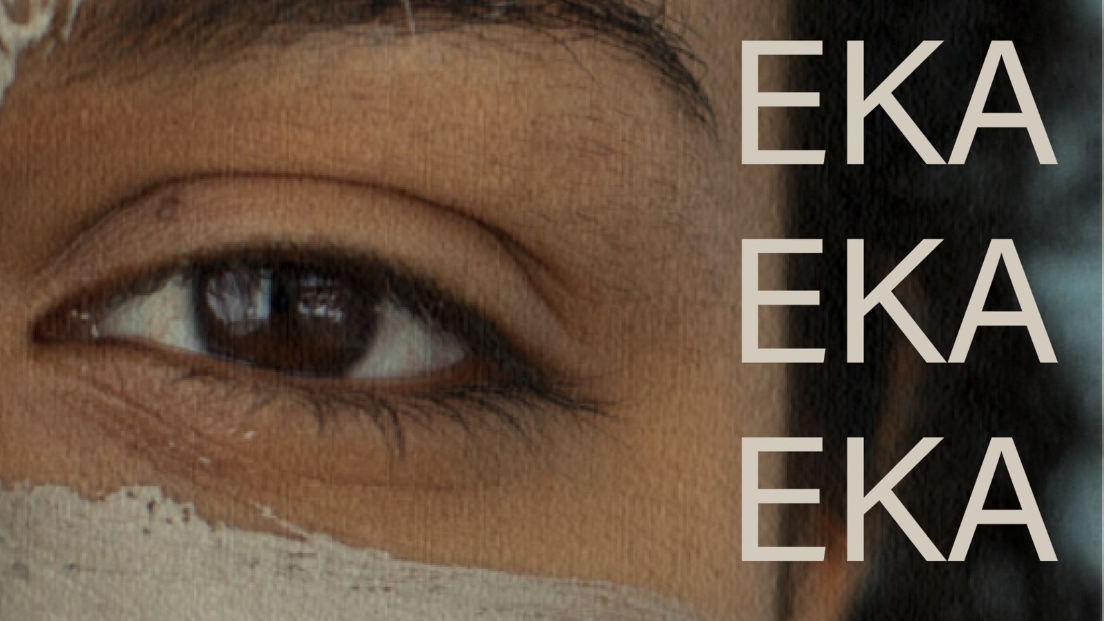
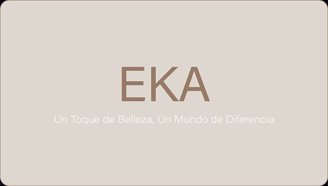
The old emblem was replaced with a clean, geometric wordmark. Three letters, no distractions — letting the brand name speak with confidence and clarity.
Before
Original Logo
After
New Logo
Brand Identity
The new visual system is built around restraint and elegance. A neutral color palette inspired by natural skin tones and treatment textures, paired with a geometric typeface that feels contemporary yet timeless.
Logo Variants
Color Palette
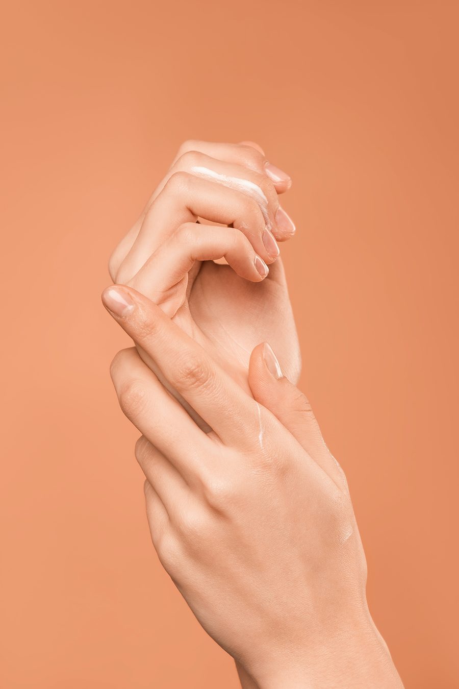
Earthy, muted tones that evoke warmth and natural beauty — reflecting the organic ingredients and gentle treatments EKA is known for.
Typography
A geometric sans-serif with clean, balanced proportions. The open letterforms and even stroke width give the brand a modern, approachable feel while maintaining a sense of premium quality.
Josefin Sans — Bold
EKA
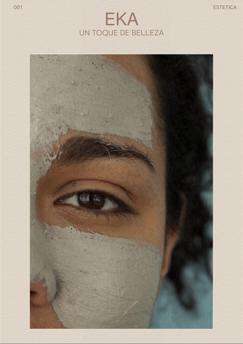
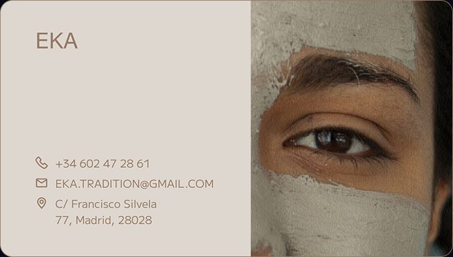
Applications
The new identity extends across every touchpoint — from printed collateral to treatment photography and digital content, creating a cohesive brand experience.
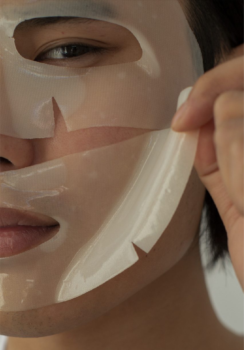


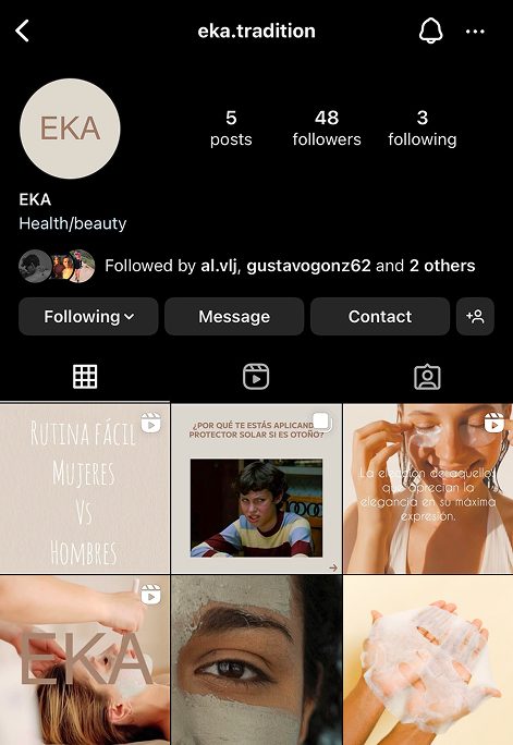
A complete social media refresh — from an inconsistent, unbranded feed to a curated visual presence that reflects EKA’s premium positioning and connects with a new audience.
Before
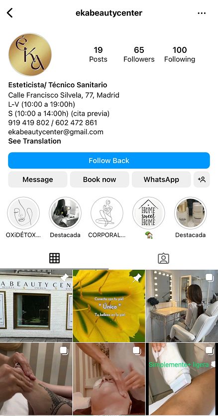
After